OMNI Design system

Overview
My Contribution
Hand-off UI for Dev
The challenge
OCB has many digital products (like mobile apps, websites, portals, etc.), but currently lacks a unified design system. This can pose significant challenges for the company and project teams, especially in product design and development.
Solution
A. Gold
😁
Consistent experience
⏱️
Saving time
📄
Clear documentation
B. Structure
There are 4 main Library:
Foundation: the main library that have token system, Graphic asset,...
Base Icon: System icon and how to create your own icon
Mobile core: All you need for mobile design
Web core: All you need for website design

Setup in Figma

C. Foundation
The foundation of a design system is crucial. It involves collecting and organizing all design elements used across products into a more structured and efficient system.
Color
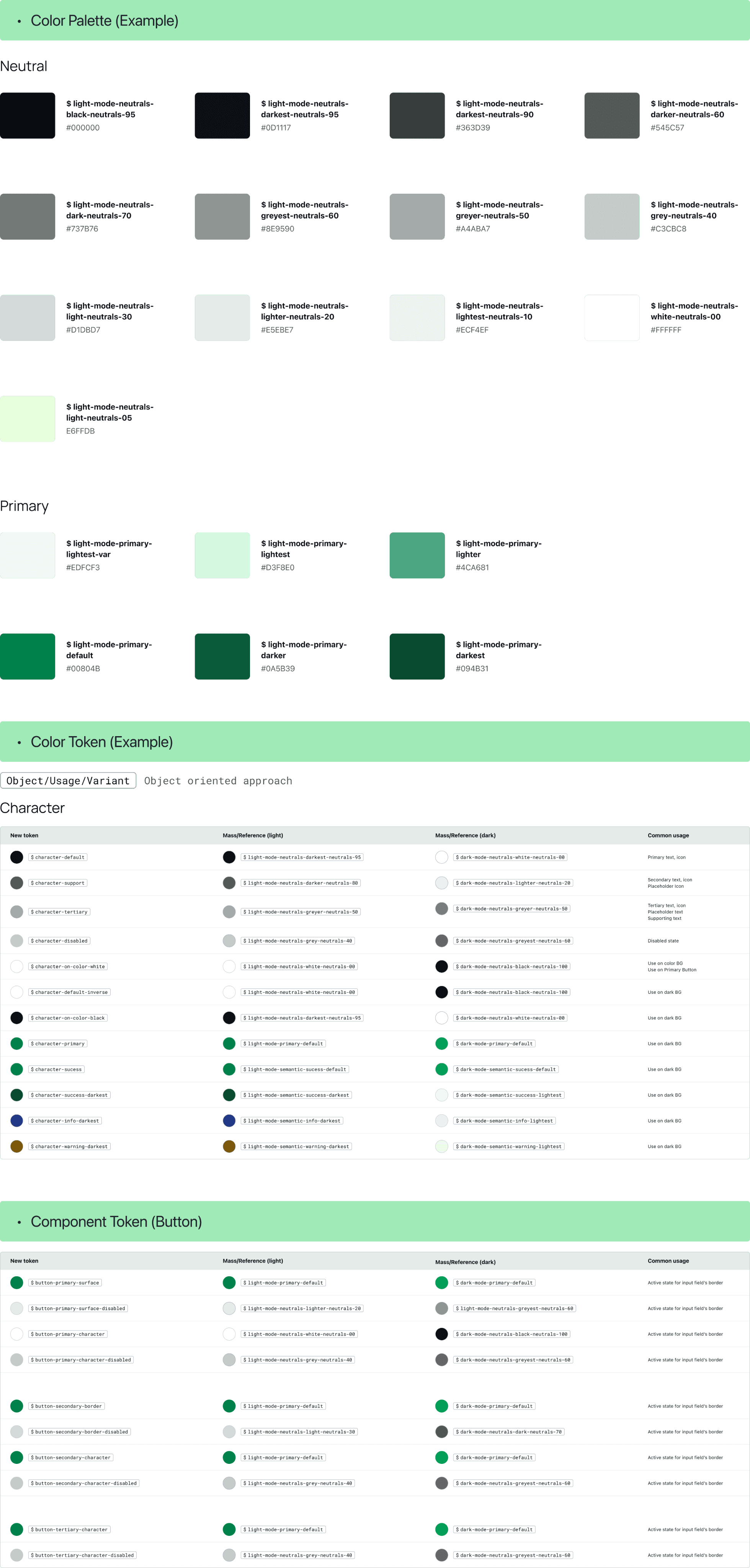
All colors are named and adjusted for better contrast and organized into design tokens for easy selection and theming (e.g., dark mode).
Icons & Illustrations
Icons are collected from the Icon library and based on Icon content (with custom icons father). There is a simple guideline to make them consistent.
16x16(px) - 24x24(px) - 32x32(px) - 40x40(px)
1.5 stroke line for outline
Center stroke
Fluent System Icon library example

Pictogram example


Components
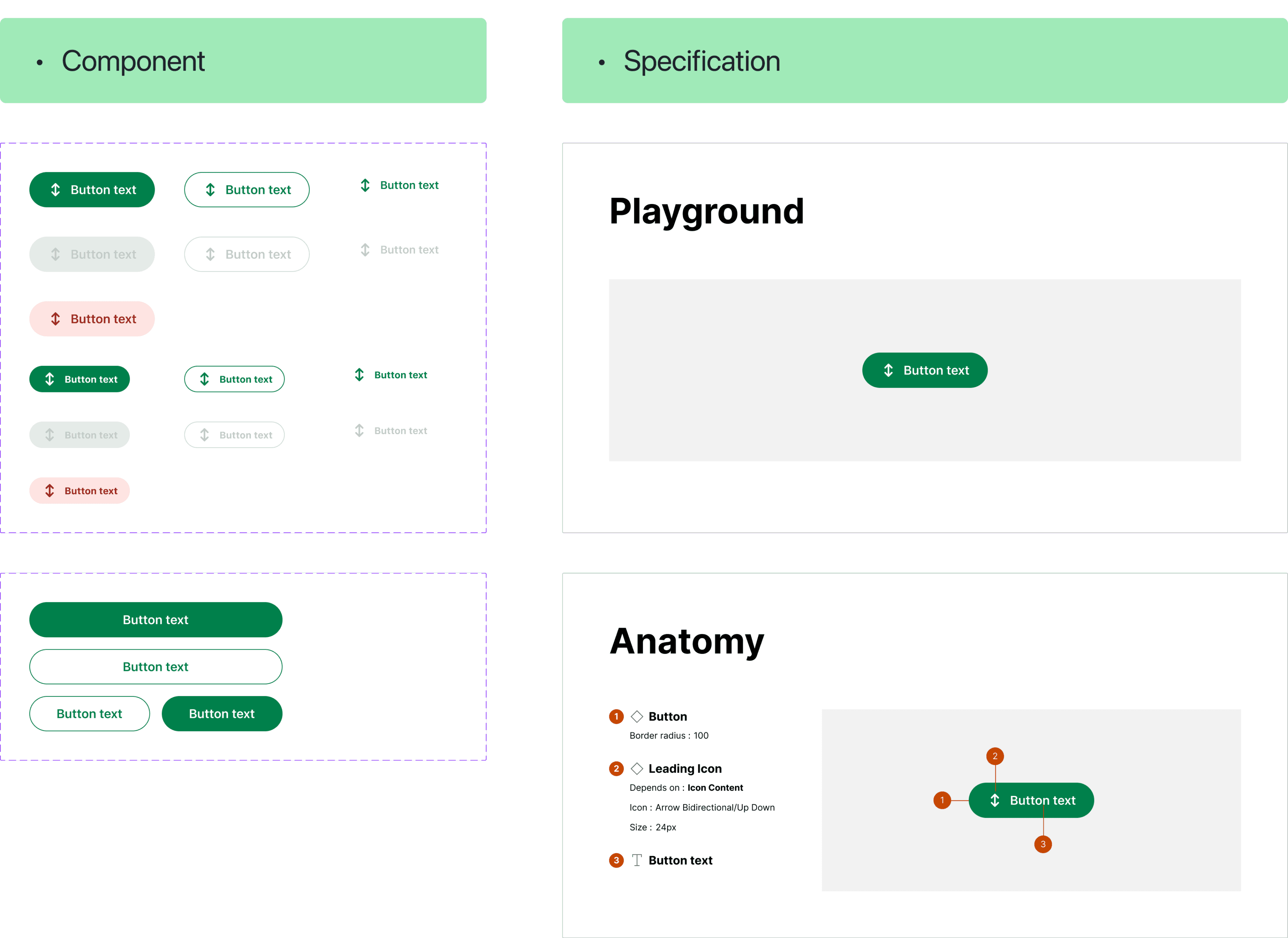
Mobil/Web core file with components and Specification site
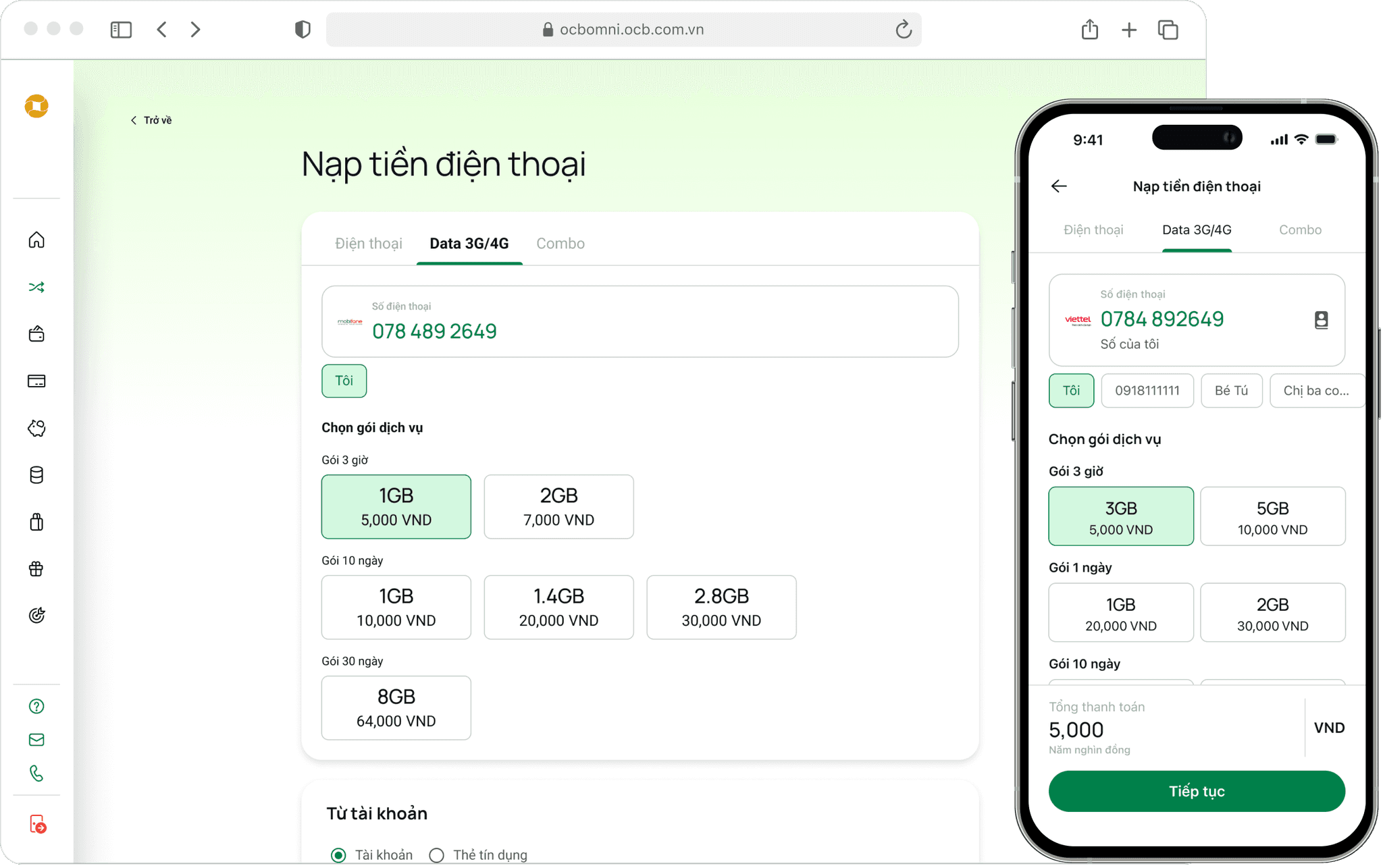
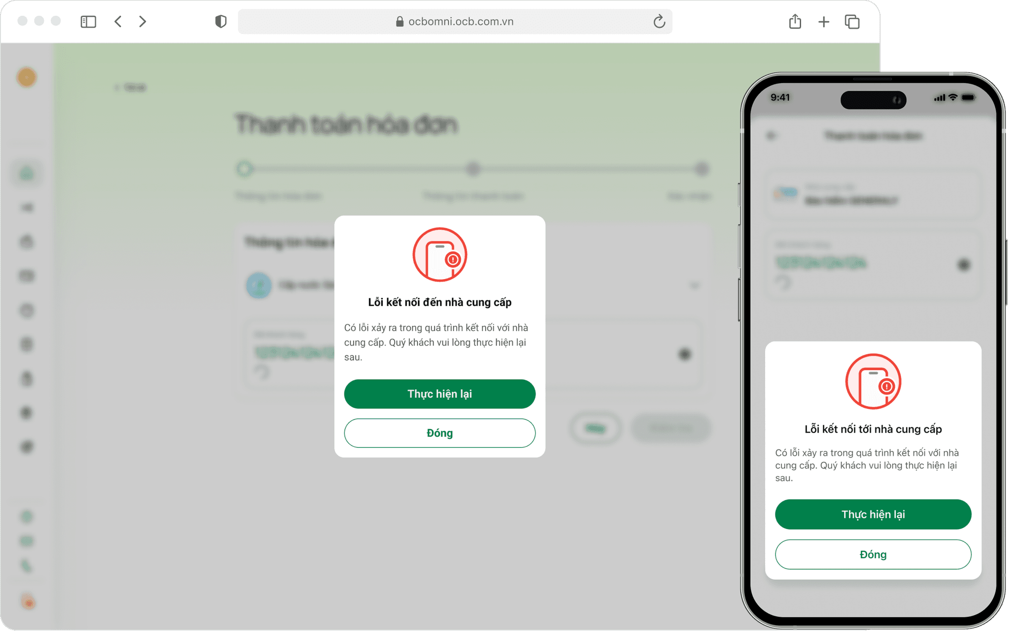
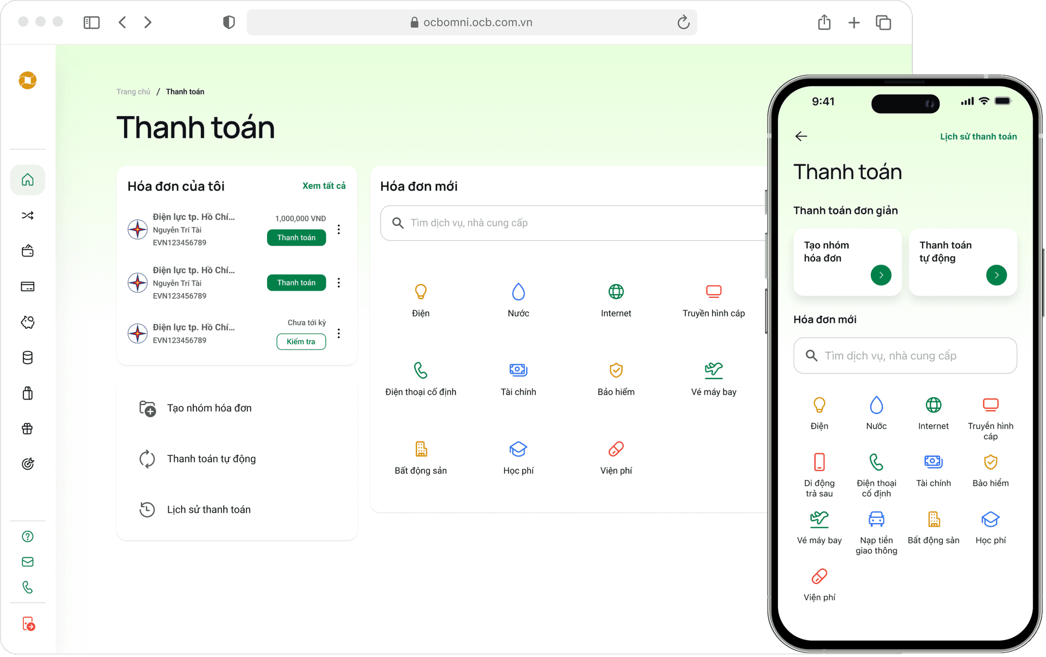
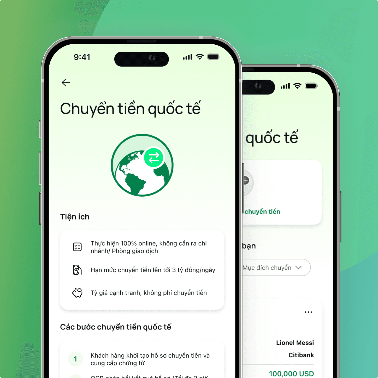
Design system applying to products
You may also like
2024
Have a good trip 😉
