Card management
Inprocess

Overview
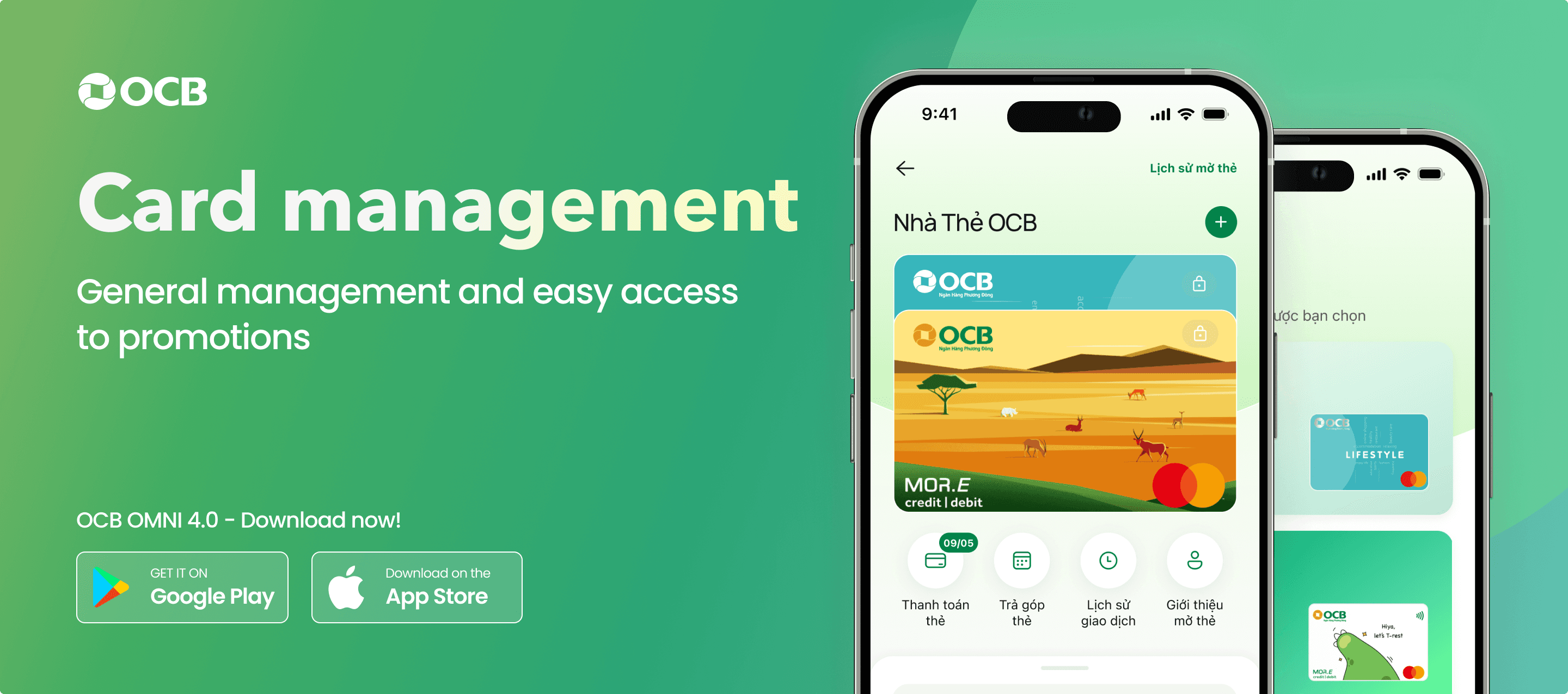
The Card Management function simplifies managing credit and debit cards with an easy-to-use design. Users can access key features, check card statuses, redeem rewards, and explore promotions, all while enjoying a modern, user-focused experience aligned with OCB’s design system.
My Contribution
UX Research
Clear business with PO
Concepts & Designing UI
Hand-off UI for Dev
User's wishes


Minh (32 years old), a finance specialist in Ho Chi Minh City, often uses credit cards for online shopping, bill payments, and travel. He needs flexible installment plans for big purchases, reminders before payment due dates to avoid late fees, and a quick way to lock the card if it’s lost.
Hoa (40 years old), a fashion store owner in Hanoi, uses credit cards to buy goods from overseas and take part in promotions. She values earning points and cashback rewards and prefers a clear, easy-to-use interface to manage her cards effectively.
Document handover

Desires for the Card Management Page
The design focuses on a simple and easy-to-use card list with stacked cards (like Apple Wallet), allowing users to interact directly without scrolling sideways. Important card statuses like "payment due soon," "overdue," or "locked" are shown clearly for better user awareness.
Key "quick actions" such as pay card, installment, settings, and transaction history are highlighted for quick and easy access.
A "Reward" button at the top right helps users quickly redeem points or withdraw cash from the loyalty system.
Scrolling up shows OCB card promotions, making it easier for users to see offers and get more value from their cards.
UI/UX Solution
First option following BRD
This UI Option 1 is designed to fully meet business needs and follow the system’s design rules. It is based on the wireframe demo, offering a clear and attractive user experience.

Suggest an alternative option
For a better solution, I suggest Option 2, which still follows business needs and the design system, but with some additional features and enhancements.

Key enhancements in this option include:
Optimized user experience with bottom sheet
Key functions like Reward Bag, Card Promotions, and Spending Management are placed in a bottom sheet. When users swipe up, the bottom sheet expands to full screen, giving a clear and spacious area for easy interaction.
This design matches modern user behavior: swiping to see details while keeping the card list tidy and organized.
Full card display, focusing on the most frequently used card
Each card is shown with a full image, making it easy for users to recognize and interact.
The most used card is always displayed first, ensuring a more personalized experience and saving users time.
Removal of the "Card type" tab
Based on OCB data, 97% of users have only one card, and only 2-3% have multiple types. The "Card Type" tab is removed to simplify the interface, as users can still recognize their card type through its name and image
3. Usability testing
After completing the design rounds with the PO and moving to round 2, I will prepare a set of questions for testing with five friends or colleagues I know to evaluate the UX/UI of the two design options. (I learned it during the research process.)

Summary
Working together with PO, BA, and UX/UI is a step-by-step process that requires open communication. UX/UI Designers need to clearly understand business needs and share ideas based on their skills, with support from the PO and BA. This teamwork helps create a shared plan to improve the product.
2024
Have a good trip 😉